Mangrove Dieback in the Gulf of Carpentaria
Learning Objectives
- Develop an understanding of the importance of mangroves in the Gulf of Carpentaria for fisheries.
- Develop an understanding of remote sensing images.
- Learn basic programming techniques to process and analyse remote sensing images (Google Earth Engine JavaScript API).
- Develop an understanding of how satellite images and vegetation indices can be used to monitor mangroves.
Activities
- Introduction to the Mangrove Dieback Event.
- Introduction to the Landsat satellites.
- Introduction to Google Earth Engine (GEE)
- Working with the GEE Map
- Working with satellite images in GEE.
- Mapping changes to vegetation
- Analysing mangrove dieback.
- Analysing mangroves through time.
1. Mangrove Dieback Event
In the 2015/2016 summer the Gulf of Carpentaria recorded the largest known mangrove dieback event. Overall, 7,650 hectares of mangrove forest with an estimated 39.4 million trees died. For comparison the surface area of Sydney Harbour is less than this area at 5,255 hectares. To understand the importance of mangroves, and how this extensive area of mangroves was impacted, we first need to understand about mangroves and climate.
Mangroves
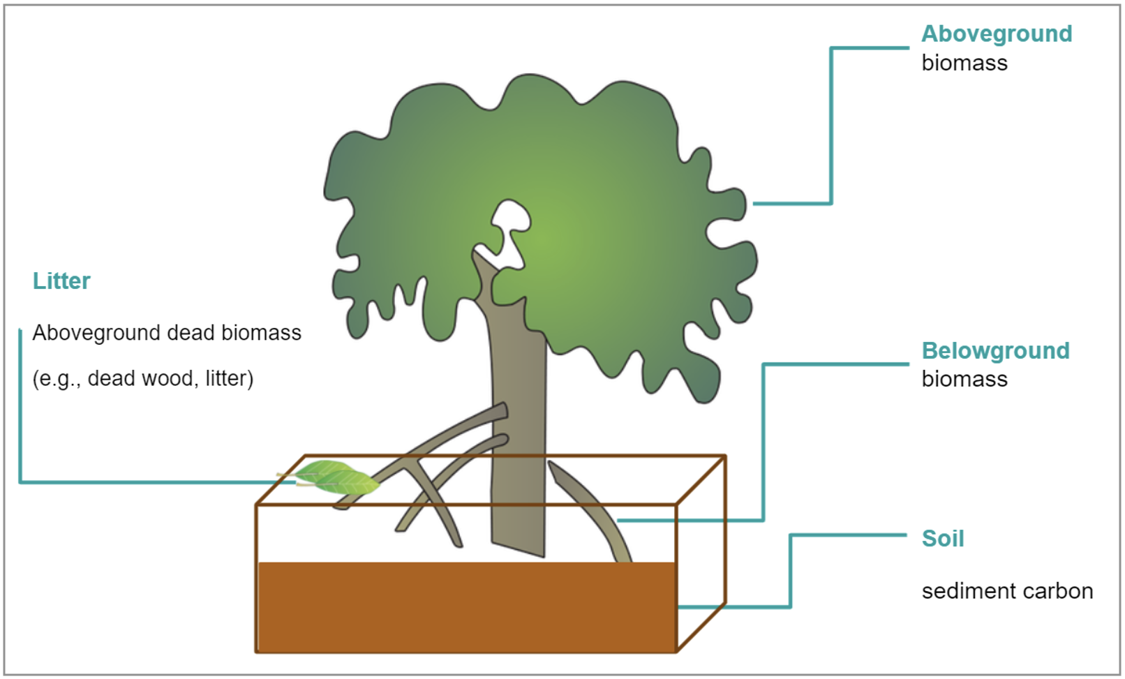
The definition of a tree as mangrove is not strictly based on taxonomic relationship, rather it is the ability of the tree to possess the traits required to survive the highly saline, tidally flooded environment that they live in. Mangrove responses to these abiotic stresses are complex and, similar to all plants, involve metabolic and physiological responses. At extremes mangroves get ‘stressed’ and display physiological responses (e.g., leaf senescence), this can affect the ecosystem services they provide, including carbon (C) sequestration and storage, and habitat for fisheries.
Air and sea surface temperature, along with salinity, oceanographic conditions and geomorphology influence species composition, forest size, tree height, productivity, and health. They also influence mangrove distribution and ecosystem health. These macro-climate and environmental variables are known limitations to mangrove forest distribution and abundance.
Climate
The climate is important in controlling these constraining traits. Extreme conditions can result in physiological thresholds being surpassed and may influence metabolic processes, such as seen in increased salinity, or drought conditions. Here, trees lose their capacity for water uptake and salt exclusion, leading to progressive loss of leaves and eventually death.
The El Nino Southern Oscillation, or ENSO, is a natural climate phenomena that results in changes in air and sea surface temperature, as well as sea level. It is categorised by three phases El Nino, La Nina, and the neutral phase.
In the tropical Pacific Ocean, ENSO can result in extreme variation in sea levels. During El Niño, weak equatorial trade winds cause the thermocline to shoal in the tropical western Pacific and the presence of cool water results in sea levels that can be lower by 20–30 cm, while conversely sea levels are higher in the east. During the La Niña phase the patterns are reversed. These sea level seesaws are intensifying with climate change and are therefore likely to increase fluctuations in tidal inundation and salinity of mangrove soils, giving rise to conditions unfavourable for tree growth.
The primary cause of the mass mangrove dieback event in the Gulf of Carpentaria was therefore a decline in the sea level, which was associated with a severe El Niño in 2015–2016. Sea levels dropped by up to 0.4–0.5 m during April to October, 2015.
Further Resources
Here are some other resources if you would like to know more about the causes and impacts of this event.
This article in The Conversation documents the causes and consequences of the dieback event:
The Northern Australia Environmental Research Portal provides detailed information and videos related to this event:
https://www.nespnorthern.edu.au/projects/nesp/gulf-mangrove-dieback/
ABC Rural Radio’s Charlie McKillop interviews David Carter, the CEO of Austral Fisheries about the mangrove dieback event. This interview took place in October 2016.
https://morethanmaps.earth/assets/other/Rural-nrn-David-Carter-welcomes-climate-change-inquiry-1010.mp3
The analysis in this workshop is based on the following publication:
Duke Norman C., Kovacs John M., Griffiths Anthony D., Preece Luke, Hill Duncan J. E., van Oosterzee Penny, Mackenzie Jock, Morning Hailey S., Burrows Damien (2017) Large-scale dieback of mangroves in Australia’s Gulf of Carpentaria: a severe ecosystem response, coincidental with an unusually extreme weather event. Marine and Freshwater Research 68, 1816-1829.
2. The Landsat Satellites
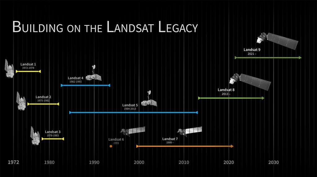
The Landsat series of satellites first started with the Launch of Landsat-1 in 1972 and have continued to the present day with Landsat-7 and Landsat-8 currently collecting images (see image below). The Landsat satellites have been designed to monitor land use and land change such as drought, fire, deforestation, flooding, urbanisation, and many other environmental and human-related changes. The Landsat programme is the world’s longest continuous archive of satellite-based images of the earth, and this will continue into the future with the launch of Landsat-9 in September 2021. The Landsat archive is an invaluable source of information for understanding the impacts of climate change on the earth.
In this workshop you will be using images captured by Landsat-8. Before we begin, it is useful to introduce the concept of resolution which is used to describe various aspects of satellites used for earth observation.
Spatial resolution refers to the size that one pixel in an image represents on the ground. Landsat-8 has a spatial resolution of 30 metres. This means that each pixel in the image represents a 30 by 30 metre area on the ground (or 900 square metres).
Temporal resolution refers to how often the satellite passes over the same location on the earth. Landsat-8 has a temporal resolution of 16 days which means that a new image of a location will be captured once every 16 days.
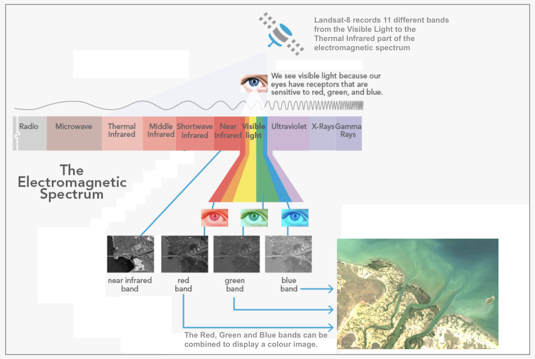
Spectral resolution refers which parts of the electromagnetic spectrum the satellite will capture in an image. The Landsat-8 satellite captures 11 different parts of the spectrum known as bands. Three of these bands are the blue, green and red parts of the visible spectrum, while the other bands are in the the longer infrared wavelengths that are not visible to the human eye (see the image below). In this workshop you will only be working with 4 bands in from a Landsat-8 image: the 3 visible bands (red, green and blue) and the near-infrared band.
3. Introduction to GEE
Google Earth Engine (GEE) is a geospatial analysis platform that runs on Google Cloud. Using Google Earth Engine you can access and analyse large amounts of geospatial data and satellite images from your web browser.
Google Earth Engine is advancing our capacity to monitor and understand changes in Earth systems due to climate change and human development through making it easier for scientists to unlock insights from big archives of satellite data.
If you haven’t used GEE before, you will first need to sign up for Google Earth Engine here: https://earthengine.google.com/signup/
Google Earth Engine programs comprise a series of statements written in JavaScript. These statements describe how to get the data you want to work with, what analysis you want to perform on the data, and how you want to see the results (e.g. a map or chart).
Load Google Earth Engine in your web browser at: https://code.earthengine.google.com and login with the email and password you used during registration.
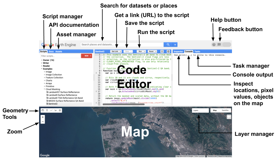
In this workshop you will be focussing on the following GEE components:
- Code Editor: where you write your JavaScript statements.
- Map: the web map used to visualise and create spatial data.
- Search for datasets or places: the web map used to visualise and create spatial data.
- Scripts manager: for managing your own collection of JavaScript files in GEE.
- Save the script: click this button to save your script.
- Run the script: click this button when you would like to run your script.
- Console output: any results and other information from your script will appear here.
- Geometry Tools: digitise vector features to use in your Google Earth Engine programs.
- Zoom: zoom the map in and out
- Layer Manager: click this button to see and control the layers you added to your map.
4. Working with the GEE Map
We will start the practical exercise by working with the GEE map interface.
Searching for a Place
Let’s start by setting the map so that it shows the Northern Territory, Australia. In the Search for places or datasets box at the top of GEE, start typing in NT Australia and you will see NT, Australia suggested under PLACES. Click on it and the map will centre on the Northern Territory.
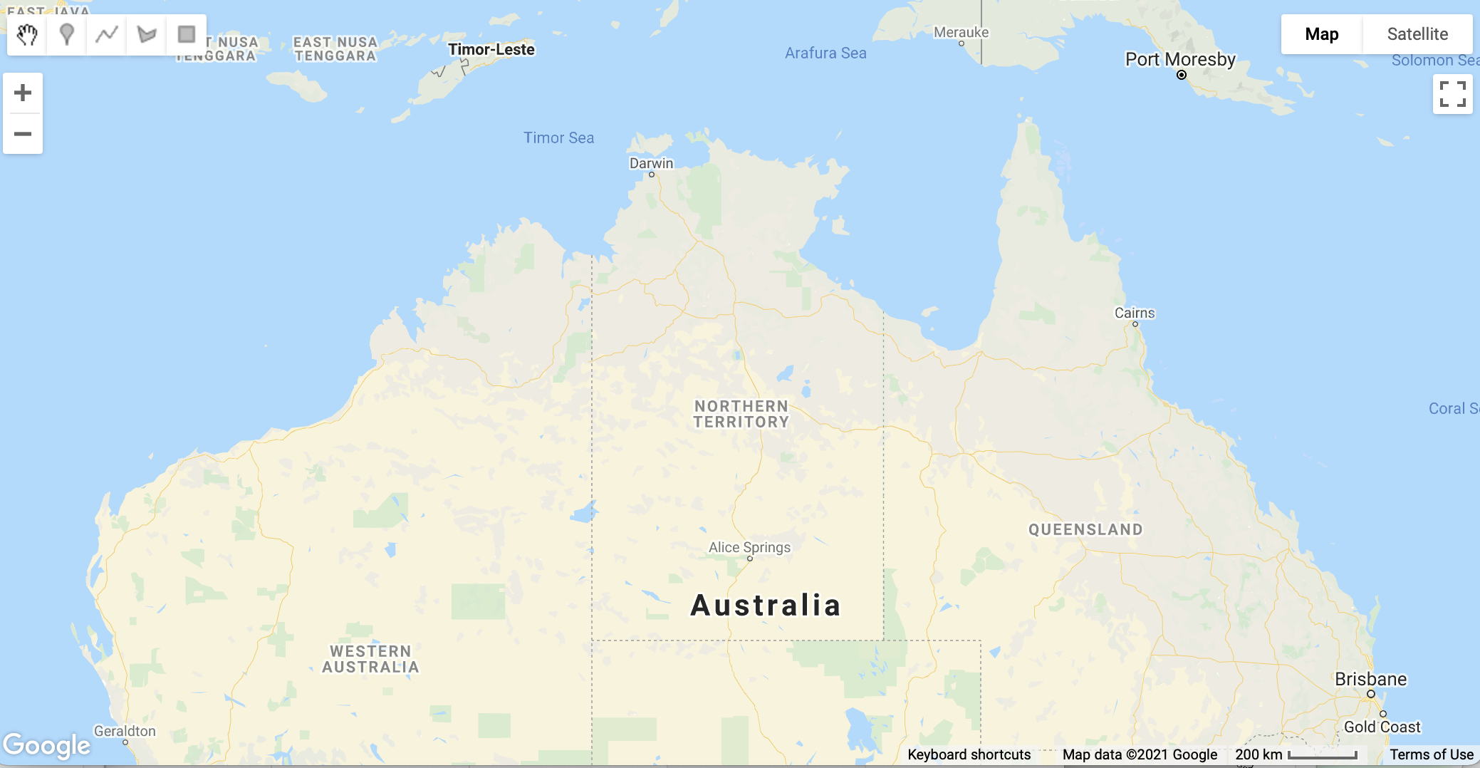
You can use the Zoom tool in the map window to zoom in and out, and click and drag the map to change the view. However, we want to set the location and zoom level in our script so the map will always be placed at the study area when we run the script.
Setting the Zoom Level
GEE allows you to control the map in the bottom half of the window using the Map object in your javascript code. The Map object has many functions which including setting the zoom level, centring the map in a location, and adding layers (images or features) so they can visualised.
First, let’s set the zoom level. Enter the following into the main code editor window:
Map.setZoom(6);
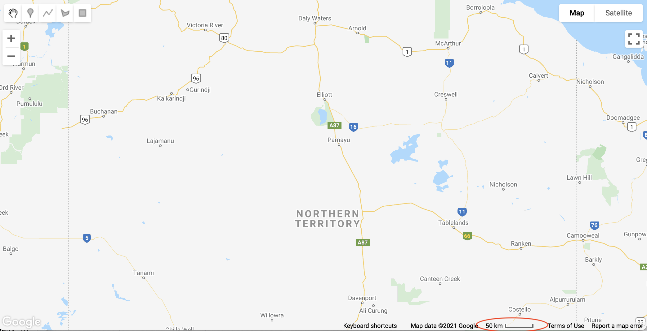
Now click the Run button. You should see the map zoom into the Northern Territory. The setZoom() function takes one parameter - a number between 0 and 24. Try changing the zoom level in your script to 5 and click Run again and your map will zoom out. Now try a zoom level of 7 and the map should zoom in. You can find the map scale at the bottom of the map window (circled in the image below). Note also that lines of code should always end with a semi-colon ;.
Before you continue any further, let’s save the script. Click the Save button and enter the File Name as mangrove-gulf-dieback.js and click OK.
Remember, it is a good idea to save your script after each step so you don’t lose any of your work.
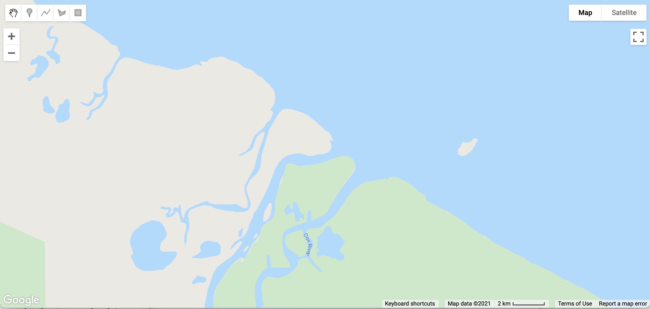
Centring the Map
Now you need to centre the map on the study site of Cox River in the Northern Territory. You will do this by creating a geographic feature, in this case a simple point, and centre the map on this point.
First, let’s create the point feature. Add the following as the next line in your script:
var CoxR = ee.Geometry.Point([135.7, -15.1]);
The ee.Geometry.Point() function creates a new point feature and saves it in a new variable CoxR. When creating this feature, you only need to provide one parameter: an array (denoted by the square [ ] brackets) containing two decimal numbers: the longitude and the latitude of the point. As the study site is east of the prime meridian and south of the equator, the longitude value is positive (east) and the latitude is negative (south).
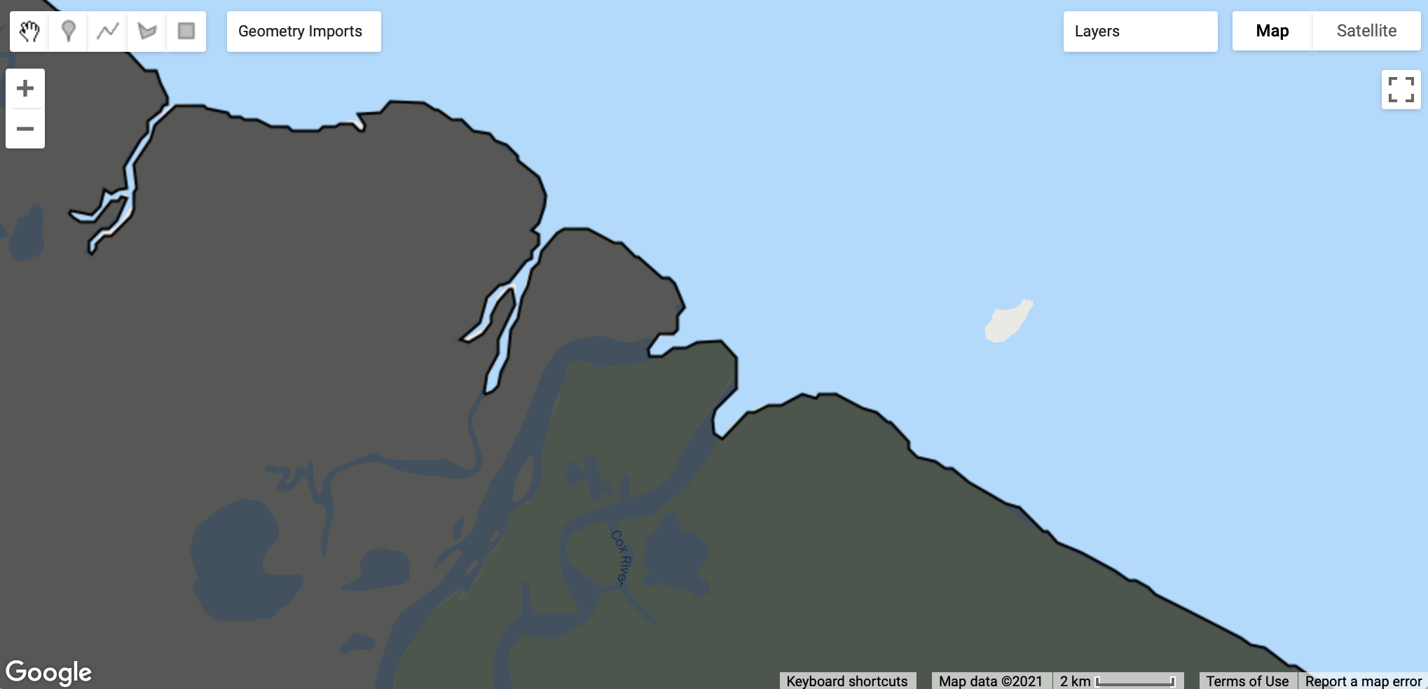
Now you can centre the map window on this location by adding the following line to your script:
Map.centerObject(CoxR, 12);
The Map.centreObject() function takes two parameters: an object to center on (in this case the CoxR point feature) and a zoom level. The zoom level has the same effect as Map.setZoomLevel() function you used above but allows you do the center and zoom in one step. Run your script to see the effect on the Map window. It should look similar to the map below:
Mapping Layers
You can also add layers to overlay on the base map window. Let’s add the point you just created:
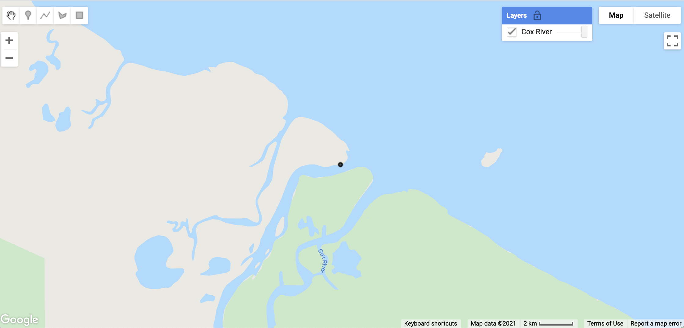
Map.addLayer(CoxR, {}, "Cox River", false);
The Map.addLayer() function takes 4 parameters: a layer to display (in this case the CoxR point), visualisation parameters between the curly braces {} which describe how to style the layers (we are not providing any), a descriptive label for the layer that will be used in the map window, and a boolean flag (i.e. true or false) indicating whether the layer is visible or not by default (in this case it is turned off).
Click Run and then click the Layers button in the map window and you will see the layer Cox River has been added. To display the layer, click the tick box next to Cox River and a single point should display near the mouth of the Cox River (see image below). Move the slider next to the layer to change the opacity (or transparency) for the displayed layer.
Summary
At the end of this section, your script should look similar to the one below; however, you will notice the first line contains two forward slashes // followed by some text. This is a called a comment in JavaScript. Comments are are useful for writing your own descriptions about what is happening in the script, or excluding lines of code from being executed. You will see that the 2nd line containing the Map.setZoom(7) is also commented out because we set the map zoom using the Map.centerObject() function so it is now redundant. Adjust your code to match the script below.
Make sure you click the Save button before you move to the next section.
// Working with the GEE Map
// Map.setZoom(7);
var CoxR = ee.Geometry.Point([135.7, -15.1]);
Map.centerObject(CoxR, 12);
Map.addLayer(CoxR, {}, "Cox River", false);
5. Working with Images
In this section, you will learn how to select and display satellite images in GEE, as well as how to remove clouds from images.
Filtering a Collection
GEE provides large collections of images from many different satellites. You will be working with images captured from the Landsat-8 satellite. You can access a collection in GEE using the ee.ImageCollection() function and provide the name of the collection. Add the following into your script (and include the comment too):
// Working with Images
var L8 = ee.ImageCollection("LANDSAT/LC08/C02/T1_L2");
The ee.ImageCollection() function takes one parameter: a string representing the collection you would like to use. The image collection is stored in the variable L8 so we can use it throughout the script.
Landsat-8 has been collecting about 750 images of the globe every day since launch in February 2013. You will therefore need to select from this large collection the images taken over the location and on the dates required. In GEE, image collections are reduced using filters.
First, we will filter the collection to the Cox River study site using the filterBounds() function:
L8 = L8.filterBounds(CoxR);
The filterBounds() function takes one parameter: an object that has a geographic extent. In this case, we can use the point feature we already used to position the map on the Cox River. Notice how we reuse the variable L8 to hold the filtered collection rather than creating a new variable. It makes our script easier to follow.
Next, we need to filter the collection further to a date before the mangrove dieback event. GEE provides a similar function filterDate() to retrieve a single image:
var beforeImage = L8.filterDate("2015-04-01", "2015-04-17").first();
The filterDate() function takes a start date and end date, and returns all images that were captured on or after the start date but before the end date. In this case, a 16 day interval chosen in April 2015 before the mangrove dieback event occurred which will select a single image.
The filterDate() function returns an image collection containing just the images between the required dates. In our case, there will be only one image in the collection, so we can easily select this by appending the first() function after the filterDate() function. The first() function returns an ee.Image() object which we save in a new variable beforeImage.
Note how we chained the two functions together like this in a single line - it makes your script simpler and easier to read by avoiding unnecessary intermediate variables.
Displaying an Image Before the Dieback Event
Now you have an ee.Image(), let’s display it on the map. But first we need to set some visualisation parameters so GEE knows how to display the image.
var vis = {"bands":["SR_B4", "SR_B3", "SR_B2"], "min":6000, "max":12000};
The above line defines a set of visualisation parameter that the Map.addLayer() understands. It includes which bands from the image should be used for the red, green and blue colour channels (in this case bands 4, 3, and 2), and the minimum and maximum pixel values to stretch the image to (in this case 6000 and 12000). We save these in the variable vis so we can easily reuse them. Now we can add the image to the map using the Map.addLayer() function you have used before:
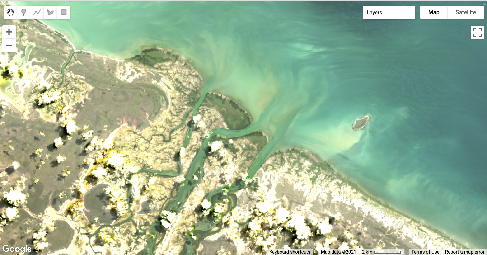
Map.addLayer(beforeImage, vis, "before image", false);
Click Run and then click the Layers button in the map window, and click the tick box next to before image. The image should display as shown below. Use the zoom tool to zoom out to see the whole image.
Displaying an Image After the Dieback Event
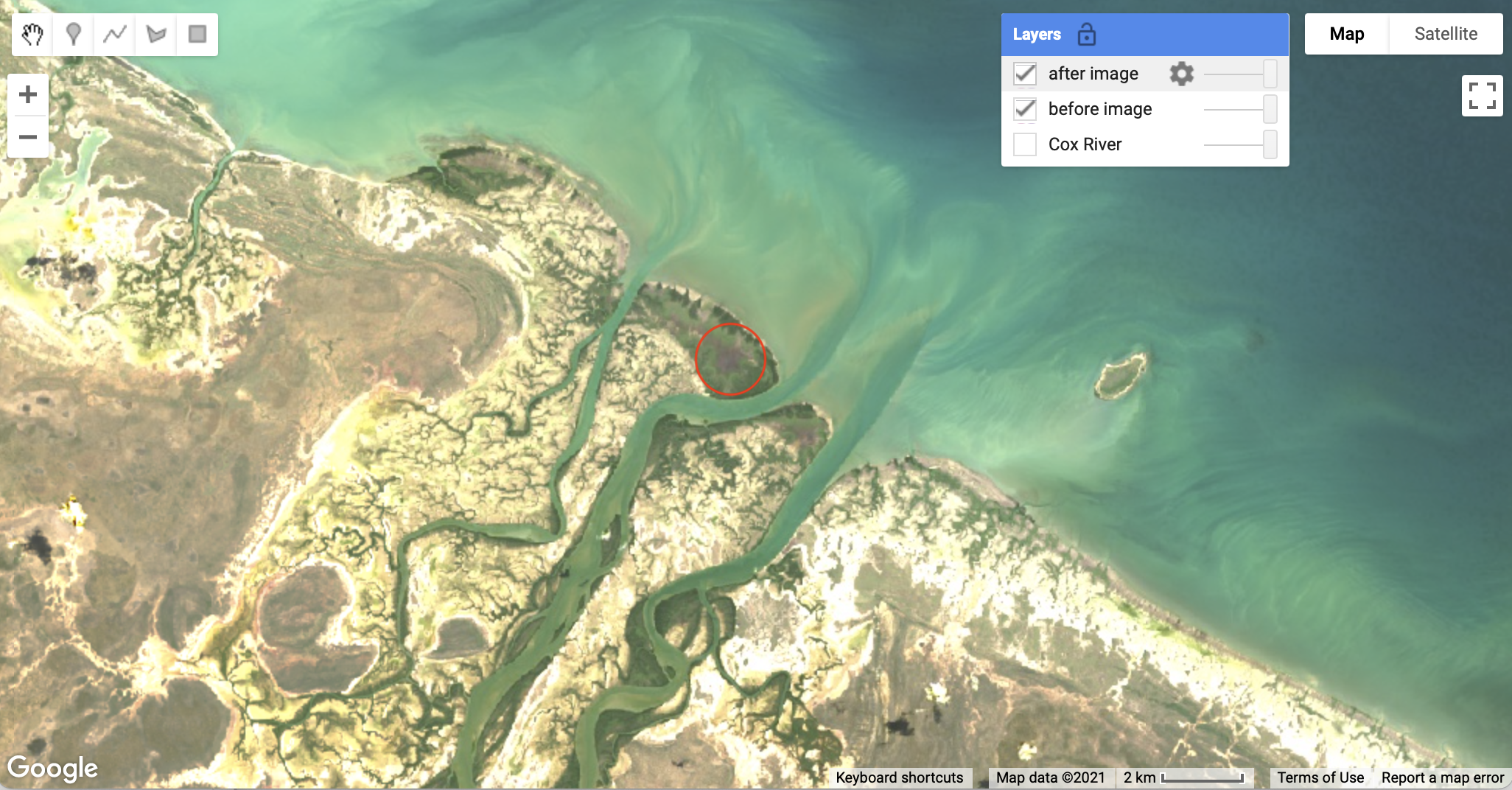
We can now repeat the above code to display an image exactly one year later, after the dieback event. The code is very similar except for the dates used to filter the image collection:
var afterImage = L8.filterDate("2016-04-01", "2016-04-17").first();
Map.addLayer(afterImage, vis, "after image", false);
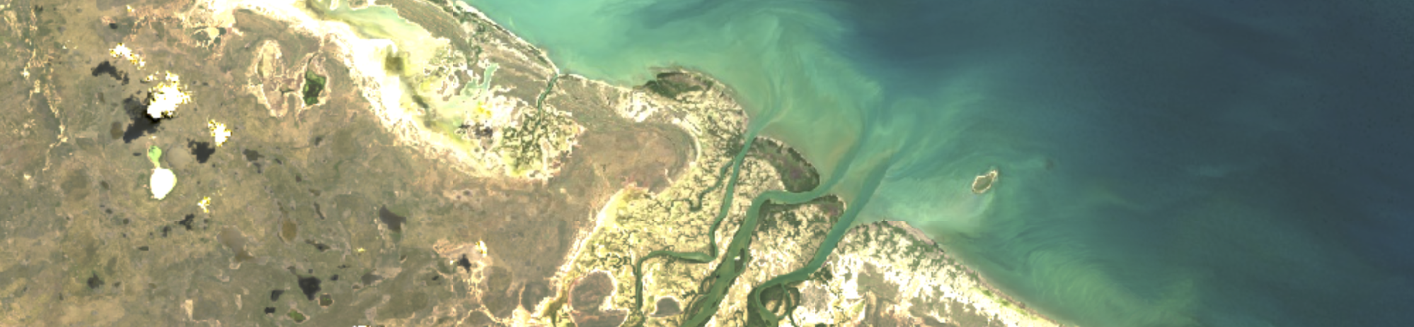
Click Run and then click the Layers button in the map window, and click the tick box next to both the before image and the after image. Use the slider next to the after image to see the changes between the two images. An area of mangrove dieback in circled in the image below. Can you see other areas along the coastline?
Removing Clouds from Images
Your may have noticed that there are clouds present in the images displayed. Clouds can present a problem when trying to analyse images from satellites so we need to exclude pixels that are affected. Landsat provides a quality assurance (QA) band with the image that we can use to do this. First, copy the following code into your script.
function removeCloud(image) {
  // Bit 0 - Fill, 1 - Dilated Cloud, 2 - Cirrus, 3 - Cloud, 4 - Cloud Shadow
  var qaMask = image.select('QA_PIXEL').bitwiseAnd(parseInt('11111', 2)).eq(0);
  return image.updateMask(qaMask);
}
The above code creates a function called removeCloud() that takes one parameter (an image) and returns that image with cloudy pixels removed. A function is a way of writing a piece of code that can be reused in your script. We won’t go into the details of how the cloud is removed by this function but ask your instructor if you would like to know more.
Now we have a function to remove cloud, we can apply it to our before and after images and add them to the map.
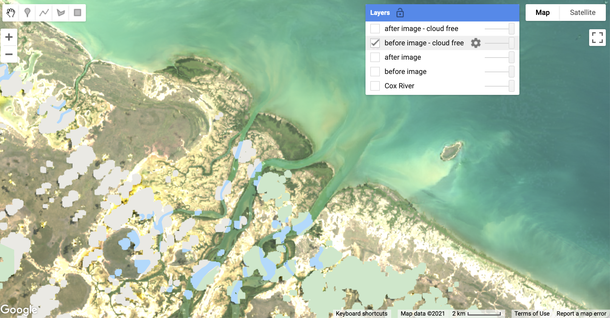
beforeImage = removeCloud(beforeImage);
afterImage = removeCloud(afterImage)
Map.addLayer(beforeImage, vis, "before image - cloud free", false);
Map.addLayer(afterImage, vis, "after image - cloud free", false);
Click Run. Turn on the new layers (using the Layers button) and see the effect of the removeCloud() function has had on both images. The before image is shown below. Note how the clouds are now transparent and the underlying map shows through.
Summary
The code from this section is summarised below. Check to make sure your code is similar, and remember to click the Save button before continuing to the next section.
// Working with Images
var L8 = ee.ImageCollection("LANDSAT/LC08/C02/T1_L2");
L8 = L8.filterBounds(CoxR);

var beforeImage = L8.filterDate("2015-04-01", "2015-04-17").first();
var vis = {"bands":["SR_B4", "SR_B3", "SR_B2"], "min":6000, "max":12000};
Map.addLayer(beforeImage, vis, "before image", false);

var afterImage = L8.filterDate("2016-04-01", "2016-04-17").first();
Map.addLayer(afterImage, vis, "after image", false);

function removeCloud(image) {
  // Bit 0 - Fill, 1 - Dilated Cloud, 2 - Cirrus, 3 - Cloud, 4 - Cloud Shadow
  var qaMask = image.select('QA_PIXEL').bitwiseAnd(parseInt('11111', 2)).eq(0);
  return image.updateMask(qaMask);
}

beforeImage = removeCloud(beforeImage);
afterImage = removeCloud(afterImage)
Map.addLayer(beforeImage, vis, "before image - cloud free", false);
Map.addLayer(afterImage, vis, "after image - cloud free", false);
6. Mapping Changes to Vegetation
In this section, you will use a remote sensing vegetation index to map vegetation, and changes to vegetation over time.
Mapping Vegetation
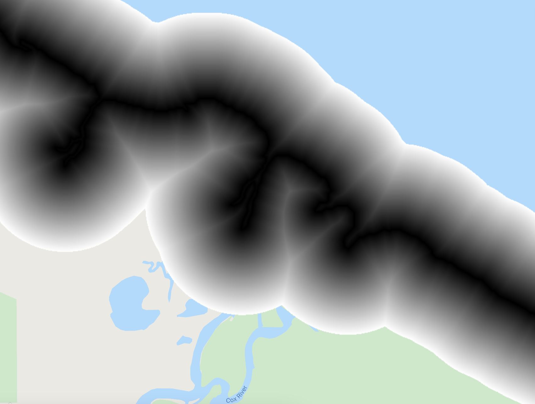
Vegetation has a unique reflectance signature compared to other surfaces on the earth. The diagram below shows the fraction of sunlight by wavelength reflected by different surfaces across the visible to near-infrared part of the electromagnetic spectrum (400 to 1000 nanometres). The approximate red and near-infrared (NIR) regions detected by Landsat are shaded.
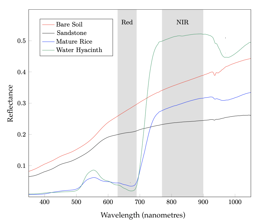
You can see in the above diagram that the two types of vegetation (rice and hyacinth) reflect very little red light. The red light is absorbed by chlorophyll in the leaves and is a critical part of photosynthesis. Compare this to the bare soil and sandstone where there is much more red light reflected. Vegetation also strongly reflects the NIR light due to the cell structure in the leaves and provides a strong contrast compared to the low levels of reflected red light.
We can use this characteristic contrast between the strong absorption in the red region with the strong reflectance in the NIR region to detect pixels that are more likely to be vegetation as opposed to other pixels that might be soil or water. We do this with a simple formula known as the Normalised Difference Vegetation Index, or NDVI. The formula is:
NDVI = (NIR - red) / (NIR + red)
The NDVI captures this contrast in a simple number ranging from -1 to +1. Pixels with negative NDVI values are very unlikely to contain vegetation, where as larger positive values are more likely to contain vegetation.
Let’s write a function to calculate the NDVI for an image:
// Mapping Changes to Vegetation
function calcNDVI(image) {
  var ndvi = image.normalizedDifference(["SR_B5", "SR_B4"]);
  ndvi = ndvi.set("system:time_start", image.get("system:time_start"));
  return ndvi;
}
The above function takes one parameter: an image. We then use the normalizedDifference() function provided by GEE to easily apply the NDVI formula and create a new image. We just need to provide a list containing the names of the NIR and red bands in the image. In this case the NIR band is SR_B5 and the red band is SR_B4. The new band is saved to the ndvi variable. The image.get() and ndvi.set() functions are used to copy the date of the original image ("system:time_start") to the new ndvi image. This will be important later when we are analysing the mangrove vegetation through time.
Now we can calculate the NDVI for the images captured before and after the dieback event by calling the calcNDVI function, and also add these results to the map:
var beforeNDVI = calcNDVI(beforeImage);
var afterNDVI = calcNDVI(afterImage);
Map.addLayer(beforeNDVI, {}, "before ndvi", false);
Map.addLayer(afterNDVI, {}, "after ndvi", false);
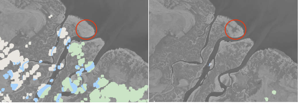
Click Run and then click the Layers button in the map window, and click the tick box next to both the before ndvi and the after ndvi. Use the slider next to the after ndvi image to see the changes between the two images. Can you see any how the NDVI decreases where there may have been impacts on the mangroves near the mouth of the Cox River? See the image below as a guide.
Mapping Vegetation Change
A simple way to map changes in vegetation between two time steps is to perform a subtraction between two NDVI images (i.e. NDVI differencing). We subtract the older NDVI image from the newer NDVI image:
NDVI Difference = NDVI (newer) - NDVI (older).
Positives NDVI difference values will likely represent increases in vegetation, while negative values represent a decrease. Let’s do this by using the subtract() function for images:
var diffNDVI = afterNDVI.subtract(beforeNDVI);
Map.addLayer(diffNDVI, {min: -0.1, max: 0.1}, "ndvi difference", false);
The subtract() function is called on the more recent image (afterNDVI) and takes one parameter: the earlier NDVI image (beforeNDVI). Once you have added the above lines to your script, click Run and then click the Layers button to turn on the ndvi difference image. Can you see any how NDVI is negative (black in colour) where there may have been impacts on the mangroves along the coastline near the Cox River?
Mapping Vegetation Loss
Since we are focussing on loss of mangroves, we are only interested in pixels where the NDVI difference value is negative. We can do this by performing a boolean less than operation on the image to find pixels that are negative.
var vegLoss = diffNDVI.lt(-0.1);
vegLoss = vegLoss.updateMask(vegLoss);
Map.addLayer(vegLoss, {palette: ["red"]}, "vegetation loss", false);
The first line calls the boolean less than function lt() on the NDVI difference image. It takes one parameter: in this case a fixed value of -0.1. This operation will create a new image (called vegLoss). This new image will only contain pixels values of 1 (where the less than condition was true) or 0 (where the condition was false).
We are only interested in the true pixels (value of 1) so we need to exclude the false pixels. We can set these pixels to be transparent by updating the image’s mask. The updateMask() function takes a boolean image (in this case the vegLoss image) and sets any pixels to be transparent where the boolean image is false. Only the vegetation loss pixels are displayed when we use the Map.addLayer() function to display the layer. Note the use of style {palette: ["red"]} so the pixels are displayed in red:
Your vegetation loss image should look the same as the above. Your map of vegetation loss could include non-mangrove vegetation. In the next section you will refine the map to reduce the likelihood of non-mangrove vegetation being included.
Summary
The code from this section is summarised below. Check to make sure your code is similar, and remember to click the Save button before continuing to the next section.
// Mapping Changes to Vegetation
function calcNDVI(image) {
  var ndvi = image.normalizedDifference(["SR_B5", "SR_B4"]);
  ndvi = ndvi.set("system:time_start", image.get("system:time_start"));
  return ndvi;
}

var beforeNDVI = calcNDVI(beforeImage);
var afterNDVI = calcNDVI(afterImage);
Map.addLayer(beforeNDVI, {}, "before ndvi", false);
Map.addLayer(afterNDVI, {}, "after ndvi", false);

var diffNDVI = afterNDVI.subtract(beforeNDVI);
Map.addLayer(diffNDVI, {min: -0.1, max: 0.1}, "ndvi difference", false);

var vegLoss = diffNDVI.lt(-0.1);
vegLoss = vegLoss.updateMask(vegLoss); // Mask out non-loss pixels
Map.addLayer(vegLoss, {palette: ["red"]}, "vegetation loss", false);
7. Analysing Mangrove Dieback
In this section, you will refine the vegetation loss map to exclude areas that are less likely to have mangroves. You will then calculate the area of mangrove dieback. In the final step, you will look at the NDVI of mangrove areas through time.
Mapping the Coastline
In order to exclude vegetation loss that is less likely mangroves, we need to define the area where mangroves are more likely to grow. Mangroves grow in fine sediment in the intertidal zones of coastal rivers, estuaries and bays. We can exclude pixels that were mapped as vegetation loss that are a long way from the coastline as less likely to represent mangrove dieback.
To map the coastline, you will use a geometric feature collection supplied by GEE of Large Scale International Boundary (LSIB) polygons representing coastlines national boundaries. Just like an image collections, a feature collection can be filtered in different ways. We will use the descriptive attributes associated with the features (known at metadata) to filter the collection so we only have the coastline for Australia.
// Analysing Mangrove Dieback
var coastline = ee.FeatureCollection("USDOS/LSIB/2017")
  .filterMetadata("COUNTRY_NA", "equals", "Australia");
Map.addLayer(coastline, {}, "coastline", false);
The first line of this code creates a new feature collection called coastline using the ee.FeatureCollection() function with the collection name of "USDOS/LSIB/2017". The filterMetadata() is chained to this function. The filterMetadata() takes three arguments: a metadata field name (in this case "COUNTRY_NA"), an equality operator (in this case "equals"), and metadata value (in this case "Australia"). The filtered collection is then added as a layer to the map in the same way images are.
One you have added the above lines to your script, click the Run button and turn on and check the coastline layer is displayed for Australia as shown below.
Mapping the Distance from the Coastline
We can use the distance from the coastline as method for excluding areas from the vegetation loss image as unlikely to be mangrove:
var distFromCoast = coastline.distance(5000);
Map.addLayer(distFromCoast, {min: 0, max: 5000}, "distance from coast", false);
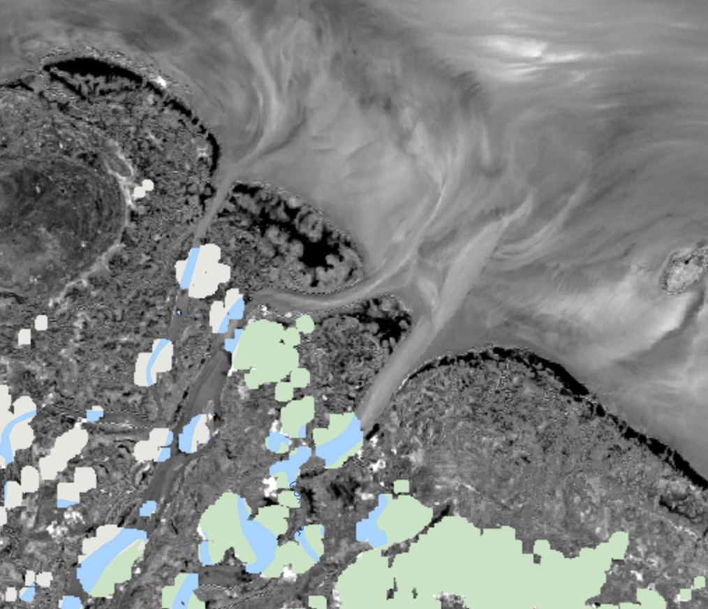
The distance() function produces a new image from a feature collection, where each pixel contains the distance to the nearest feature in metres. The distance function takes a single argument that limits how far from each pixel to search for the edge of a feature, in this case 5000 metres. If no feature is found, the pixel is masked out (i.e. transparent). Run the script and make sure your distance from coast layer looks the same as the image below.
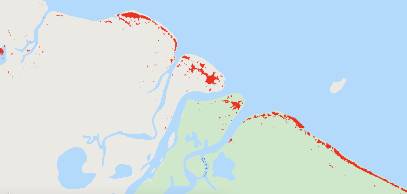
Mapping Mangrove Dieback
We can use the distance from the coast image to create a boolean (true/false) image of the area more likely to have mangroves (the mangrove zone). We will use a distance of 1.5 km from the coastline to define the mangrove zone, and then use this to exclude areas of vegetation loss unlikely to be mangroves.
var mangroveZone = distFromCoast.lte(1500);
var mangroveLoss = vegLoss.updateMask(mangroveZone);
Map.addLayer(mangroveLoss, {palette: ["red"]}, "mangroveLoss", true);
The less than or equals to function lte() is used to create a new mangroveZone image with pixel values of 1 (true) for areas within 1.5 km of the coastline, or 0 for areas that are not. We can then use this new mangroveZone image and the updateMask() function to set any pixels in the vegetation loss image that are outside the mangrove zone to be transparent.
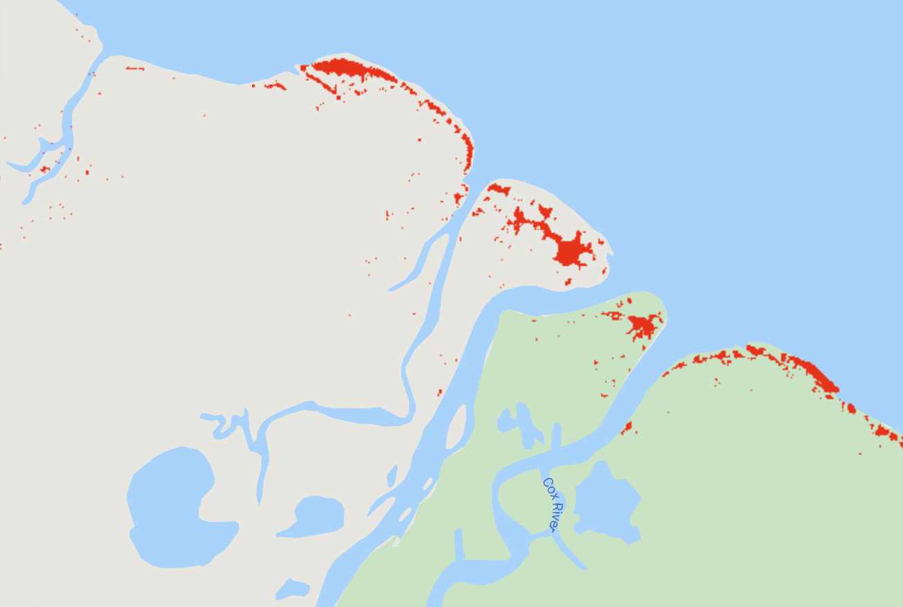
Run the script view your final mangrove loss map (it should match the image below). You can pan the map up and down the coastline to see other areas that may have mangrove dieback.
Calculating the Area of Mangrove Dieback
In order to calculate the area of mangrove dieback, we will use a reducer. A reducer in GEE is a way to aggregate data, in this case, pixels representing mangrove loss. There are lots of different reducers available in GEE, but we will use a simple count of the number of pixels:
var lossPixels = mangroveLoss.reduceRegion({
  reducer: ee.Reducer.count(),
  maxPixels: 60000000
});
lossPixels = ee.Number(lossPixels.get('nd'));
print("Mangrove Dieback Pixels", lossPixels)
The above code calls the reduceRegion() function on the mangroveLoss image. We are using a new way of calling a function by enclosing a list (in curly braces {}) of the parameters we want to pass and the value for each parameter separated by a colon :. This technique is useful if a function has a large number of parameters and you only need to provide a subset of these, and it also makes your code easier to read. We only need to pass two parameters: the reducer which in this case is a simple count of unmasked pixels ee.Reducer.count(), and the maxPixels so that GEE will process the entire image. We then need to convert the result using the ee.Number() function. We then use the print() function to display the count on the console.
Run the script and your console should display Mangrove Dieback Pixels of 27209.
We need to convert the number of pixels to square kilometres. Given a Landsat pixel is 30 m resolution, then a single pixels has an area of 900 m2. To convert this to km2 we divide by 1,000,000 (or 1000^2). We can then multiply the number of mangrove dieback pixels calculated previously by the area of a single pixel to get the total area of mangrove dieback:
var pixelArea = ee.Number(30).pow(2).divide(ee.Number(1000).pow(2));
var lossArea = lossPixels.multiply(pixelArea);
print("Mangrove Loss Area (km2)", lossArea);
The first line calculates the pixel area using a chain of functions. The ee.Number() function creates a simple number in GEE. The pow() function raises this number to a given power: in this case 2. The divide() function dives the results by the given parameter which in this case is ee.Number(1000).pow(2) which converts square metres into square kilometres. The lossArea is calculated by using the multiply() function on the lossPixels and using the pixelArea as the parameter. The print() function is used to output the result to the console.
Run the script and your console should display Mangrove Dieback Area (km2) of 24.4881.
Summary
The code from this section is summarised below. Check to make sure your code is similar.
// Analysing Mangrove Dieback
var coastline = ee.FeatureCollection("USDOS/LSIB/2017")
  .filterMetadata("COUNTRY_NA", "equals", "Australia");
Map.addLayer(coastline, {}, "coastline", false);

var distFromCoast = coastline.distance(5000);
Map.addLayer(distFromCoast, {min: 0, max: 5000}, "distance from coast", false);

var mangroveZone = distFromCoast.lte(1500);
var mangroveLoss = vegLoss.updateMask(mangroveZone);
Map.addLayer(mangroveLoss, {palette: ["red"]}, "mangroveLoss", true);

var lossPixels = mangroveLoss.reduceRegion({
  reducer: ee.Reducer.count(),
  maxPixels: 60000000
});
lossPixels = ee.Number(lossPixels.get('nd'));
print("Mangrove Dieback Pixels", lossPixels)

var pixelArea = ee.Number(30).pow(2).divide(ee.Number(1000).pow(2));
var lossArea = lossPixels.multiply(pixelArea);
print("Mangrove Dieback Area (km2)", lossArea);
8. Analysing mangroves through time
One of the powerful features of GEE is the ability to analyse the temporal pattern of phenomenon on the earth’s surface over long time periods using large collections of satellite images. We will use this capability to look at changes in the Cox River mangroves since Landsat 8 began collecting images in 2013.
To do this, we will first need to create a point feature on the map representing an area of mangrove loss in order to extract time series information from Landsat 8.
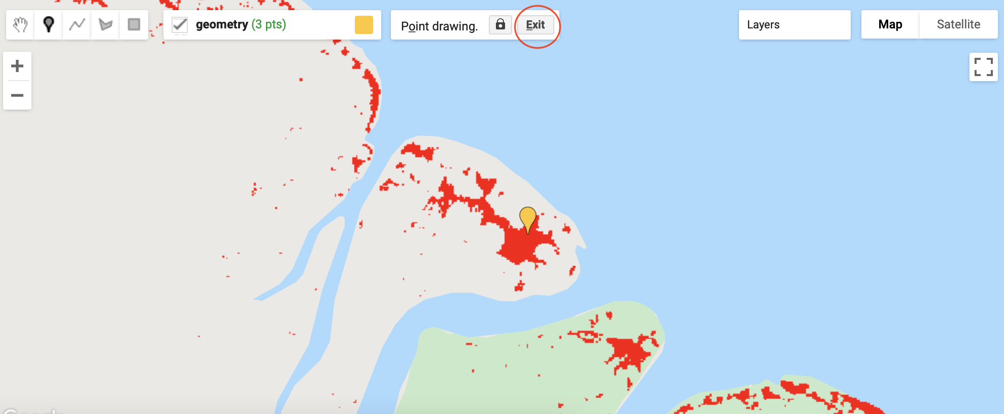
First, make sure that the only layer turned on in your map is the mangroveLoss layer, and all other layers are turned off. Then, in the map window, click on the marker icon in the Geometry Tools (circled on the image below). This will put the map into point drawing mode.
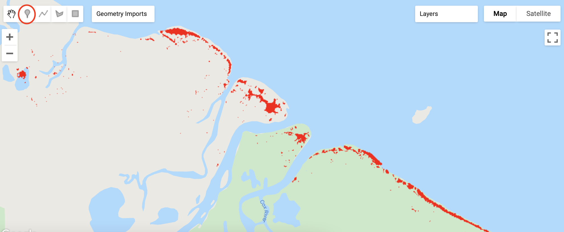
Next, click on the mangrove loss area near the mouth of the Cox River to create a point. Make sure the tip of the point is over a mangrove loss area. See the image below as a guide but it doesn’t need to be exactly the same. You can also zoom in to help place the marker. Don’t worry if you make a mistake, as you will get the change to move or delete markers. Click the Exit button at the top of the Map window (circled in the image below).
If you need to move your point, click on it once and it will enlarge, Then click and drag it to the new location, or click Delete at the top of the map window to remove it.
Once you have your first marker in place, we can now do a time series analysis for this location.
We will be using all available Landsat 8 images since the satellite was launched in 2013. We have already imported the Landsat 8 image collection at the top of this workshop. First, we need to remove clouds and create a collection of NDVI images:
// Analysing mangroves through time
L8 = L8.map(removeCloud);
var ndviImages = L8.map(calcNDVI);
Both of these lines use a the map() function. The map function will run an algorithm over every image in an image collection and return a new image collection. The parameter passed to map() must be an algorithm or function that receives an image and returns an image. We have already created functions to remove clouds, and calculate the NDVI, so is very simple for us to run these two functions over the entire Landsat 8 image collection. The result is a collection of NDVI images.
Now that we have a collection of NDVI images, we can use the point marker we created on the map to create a chart of the NDVI pixel value at the marker location through time.
var chart = ui.Chart.image.seriesByRegion({
  imageCollection: ndviImages,
  regions: geometry,
  reducer: ee.Reducer.mean(),
  xProperty: "system:time_start",
});
GEE provides many different charing functions. Here we are using the ui.Chart.image.seriesByRegion() function. We are using the series by region as we want to extract the NDVI values in the region covered by the point marker. We provide the function the imageCollection: which is the ndviImages. The regions: parameter is set to geometry. This is the default name of the feature collection used to keep the point marker you created on the map. We also need to provide a reducer:. A reducer is important if the regions were polygons, but given our region is a single point it doesn’t need to be reduced any further. However, the parameter is required so we set it to ee.Reducer.mean(). The chart will extract the NDVI value at our point marker location through time and this will represent the y-value in the chart. However, we need to also specify the x-value for the chart, and in this case it is the date of the image which is stored in the NDVI image metadata as "system:time_start". You will remember now why it was important that we copied this attribute in the calcNDVI() function we created earlier.
Now we can also make some cosmetic changes to the chart such axis titles and text styling:
chart = chart.setOptions({
  title: 'NDVI Time Series',
  hAxis: {title: 'Date', titleTextStyle: {italic: false, bold: true}},
  vAxis: {title: 'NDVI', titleTextStyle: {italic: false, bold: true}},
  interpolateNulls: true
});
print(chart);
The setOptions() function for the chart contains one important parameter: interpolateNulls:. Given that clouds are almost certain to occur in one or more of the images at the point marker location, there will be missing (or null) values for the NDVI. This can make the chart difficult to interpret. By setting interpolateNulls to true the chart will guess the missing values and draw a continuous line. The print() function is used to display the chart in the console.
Run the script and your console should display a chart similar to the one below. Remember, you will have placed the point marker in a slightly different location so the chart will not match exactly.
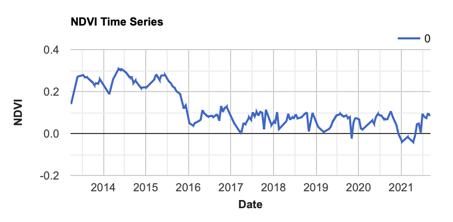
Trace your mouse pointer along the line representing the NDVI in the chart and the date and NDVI value will be displayed. What season (or months) do you think the mangrove dieback event occurred? Do you think the mangroves recovered in the years that followed? What do you think might cause the other smaller variations in the NDVI both before and after the dieback event?
Click on the point marker to go into edit mode. Then click and drag the point marker to a new location on the coast where there was mangrove dieback according to your map, and click the Exit button at the top of the map. Run the script again. Do you see the same temporal pattern at this new location?
Congratulations - you have reached the end of the workshop. Remember to click the Save before you close your browser window.
Summary
The code from this section is summarised below. Check to make sure your code is similar.
// Analysing mangroves through time
L8 = L8.map(removeCloud);
var ndviImages = L8.map(calcNDVI);

var chart = ui.Chart.image.seriesByRegion({
  imageCollection: ndviImages,
  regions: geometry,
  reducer: ee.Reducer.mean(),
  xProperty: "system:time_start",
});

chart = chart .setOptions({
  title: 'NDVI Time Series',
  hAxis: {title: 'Date', titleTextStyle: {italic: false, bold: true}},
  vAxis: {title: 'NDVI', titleTextStyle: {italic: false, bold: true}},
  interpolateNulls: true
});
print(chart);

// The End